Why My AI-Generated UI Looked Generic (and How I Fixed It)
Key Takeaways
- AI agents produce the statistical mean of their training data. Distinctive design lives in the tails of the distribution, which models systematically lose. You cannot prompt your way to quality UI if the model has averaged every good dashboard with a million mediocre ones.
- A design sandbox separates exploration from commitment. A
research/designsfolder with throwaway React components is the AI-era equivalent of a designer’s sketchbook — letting you iterate visually before touching production code. - Structured design skills beat ad-hoc prompting. Breaking the design process into discrete phases (critique, audit, polish, harden) mirrors how human designers actually work — and the research backs it up. Moderate constraints produce the best creative output.
- Your design language must be easily machine-readable. Human-readable Figma docs and Notion pages are not as directly digestable for coding agents. Encoding your design system as structured rules the agent can consume is the infrastructure investment that makes everything else work.
If you’ve used a coding agent to build any kind of frontend, you’ve seen it: the output looks fine but somehow wrong. The same rounded corners. The same Tailwind Blue gradients. The same card-in-card layouts with Inter font and bounce animations on everything. It has that recognizable “AI made this” quality that’s hard to articulate but impossible to unsee.
I spent months trying to prompt my way out of this. “Make it look like Linear.” “Use better spacing.” “Be more creative with the layout.” None of it worked consistently. The agent would nail one component, then produce something generic on the next.
The breakthrough wasn’t a better prompt. It was a better workflow.
Why AI-Generated UIs Look the Same
Before getting into the fix, it’s worth understanding why this happens — because the cause shapes the solution.
The averaging machine problem
LLMs don’t design. They compute the weighted average of every interface they’ve seen in training. A 2024 study published in Nature documented this formally: models trained on generated data experience “model collapse,” where they lose information about the tails of the distribution and converge to substantially reduced variance[1]. The outputs trend toward the center — toward the mean — and away from anything distinctive.
This is structural, not fixable with better prompting. When you ask an agent to build a pricing page, it doesn’t reason about visual hierarchy or brand differentiation. It produces the average pricing page across its training corpus. That average happens to look like shadcn/ui with a purple gradient, because that’s what millions of templates look like.
Default stack bias compounds the problem
It gets worse. Most AI coding tools assume React + Tailwind + shadcn/ui. With tools like v0, Cursor, and similar builders defaulting to shadcn-style patterns, the outputs converge further. The specific “look” — that shade of Tailwind Blue, the same fonts, same rounded corners, that clean yet robotic layout — signals “AI made this” to anyone paying attention[2].
The UI Craft project maintains a specific “anti-slop” banned list of telltale patterns: purple-cyan gradients, glassmorphism, gradient text on metrics, identical card grids, bounce/elastic easing, nested cards within cards[3]. If you’ve seen these in your agent’s output, now you know why.
The one-shot problem
There’s a deeper issue: when you ask an agent to “build a pricing page,” you’re asking it to simultaneously make design decisions (layout, hierarchy, color, spacing), implement those decisions in production-quality code, and integrate with your existing component system. That’s three fundamentally different tasks compressed into one generation. No human designer works that way. Not at Stripe. Not at Linear. Not anywhere that produces good interfaces.
The professional design process is sequential: rough layout, then hierarchy refinement, then color and typography, then interaction polish, then accessibility audit, then final critique. Each phase builds on the last. Compressing that into a single prompt is asking for mediocrity.
The Workflow: Three Phases
Here’s the system I’ve settled into. It’s not complicated, but each phase exists because I learned the hard way what happens without it.
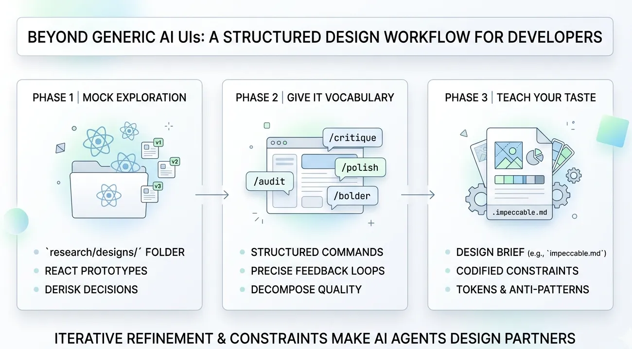
Phase 1: The Design Sandbox
The first change: I stopped asking agents to design inside my production codebase. I created a research/designs folder with standalone React components that exist purely for visual experimentation.
The idea is simple. Each component is a self-contained mockup — no API calls, no state management, no integration concerns. Just visual output I can render in a browser and evaluate. When I like a direction, I port the design decisions (not the code) into my actual application. When I don’t, I delete the file and try again. Zero cost.
research/ designs/ pricing-v1.tsx # Card-based layout pricing-v2.tsx # Comparison table approach pricing-v3.tsx # Minimalist single-tier dashboard-nav.tsx # Navigation explorationThis works because it restores what software engineering calls a “design spike” — a timeboxed exploration period where the goal isn’t production code but learning. Thoughtbot describes the spike as “a quick exercise that lets you explore solutions without the burden of writing good code, then throwing it all away so you can do it the right way with confidence”[4].
Why this matters quantitatively
A foundational study from Nielsen Norman Group compared three approaches to design[5]:
- Selecting the single best design from 4 alternatives: 56% usability improvement over the average
- Merging the best ideas from all alternatives: 70% improvement
- One iteration on the merged design: 152% improvement
The sandbox gives you the ability to do all three — generate multiple directions, evaluate them side by side, and iterate on the winner — at almost no cost. Without it, you’re locked into the first thing the agent produces.
What I actually do
I ask the agent to create a mockup in research/designs/, open it in the browser, and evaluate. If I don’t like the spacing, I tell the agent to fix it — in the sandbox file. If I want to try a completely different layout, I ask for a new version. The iteration cycle is fast because there’s nothing at stake. No production code is touched until I’ve found a design direction I’m confident in.
Phase 2: Structured Design Skills
The sandbox gives me room to iterate, but the quality of each iteration still depends on how I direct the agent. This is where structured design skills come in — and where I found the biggest improvement.
I use Impeccable, an open-source design skill created by Paul Bakaus (the original creator of jQuery UI). It provides over 20 structured commands that break the design process into discrete, focused phases[6]. Instead of asking the agent to “make it look good,” I apply specific operations in sequence — the same way a professional designer would work through critique, refinement, and polish as separate passes.
Why structured commands work better than ad-hoc prompting
This isn’t just preference. A meta-review of 145 empirical studies found that the relationship between creativity and constraints forms a U-shaped curve — moderate constraints produce the best creative output[7]. Too few constraints cause complacency (the agent defaults to the statistical mean). Too many cause paralysis. Structured commands hit the sweet spot.
There’s a direct parallel in AI engineering. LangChain improved their coding agent from 52.8% to 66.5% on benchmarks — jumping from Top 30 to Top 5 — by modifying only the harness infrastructure, not the underlying model[8]. The constraints made the same model dramatically better. The same principle applies to design: you’re not changing the model, you’re giving it better constraints to work within.
The Impeccable command vocabulary
Here’s what the command set looks like in practice. I’ve grouped them by the phase of the design process they target:
Evaluation commands — understanding what you have:
/critique— Evaluates the design from a UX perspective. This is where I start after every sandbox mockup. It identifies hierarchy problems, flow issues, and usability gaps before I waste time polishing something fundamentally broken./audit— Runs a technical quality check across accessibility, performance, semantic HTML, responsive behavior, and common anti-patterns. This catches the things that look fine visually but fail for screen readers or on mobile.
Refinement commands — improving what exists:
/polish— Performs the final quality pass: fixing alignment, spacing consistency, visual rhythm. The micro-details that separate “done” from “crafted.”/optimize— Diagnoses and fixes UI performance issues. Unnecessary re-renders, heavy animations, layout thrashing./harden— Improves interface resilience through better error handling, loading states, and edge cases. The states most developers (and agents) forget./normalize— Audits the interface and realigns it to match your design system standards. Catches drift where the agent improvised instead of following established patterns.
Expression commands — adjusting the visual voice:
/bolder— Amplifies and intensifies the design. Makes it louder, more confident. Useful when a prototype feels too timid./quieter— Dials down visual noise. Reduces contrast, simplifies elements, creates breathing room./clarify— Improves information hierarchy and readability. Restructures content so the most important elements are immediately obvious./distill— Reduces to essentials. Removes decoration that doesn’t serve function./adapt— Adjusts the interface for different contexts or screen sizes.
Detail commands — targeting specific design dimensions:
/animate— Adds purposeful motion and micro-interactions. Not bounce animations on everything — contextual transitions that reinforce user actions./arrange— Restructures layout and spatial relationships between elements./typeset— Refines typography: scale, weight, line-height, letter-spacing./delight— Adds moments of personality — subtle interactions, copy refinements, micro-animations that make an interface feel human./colorize— Refines the color palette and application. Works within your palette rather than inventing new colors./onboard— Designs the first-run experience. Empty states, tooltips, progressive disclosure for new users./overdrive— Pushes the design to its expressive maximum. Useful as a reference point — you can always pull back, but it’s valuable to see how far a direction can go.
How I actually use these
I don’t use all 20+ commands on every component. The typical sequence after creating a sandbox mockup is:
/critique— What’s fundamentally wrong?- Fix the structural issues identified
/audit— What technical problems exist?- Fix accessibility and responsive issues
/polish— Clean up the details/normalize— Align to design system
That four-step loop — critique, fix, audit, polish — handles 80% of cases. The expression commands (/bolder, /quieter, /distill) come in when the design direction is right but the intensity is wrong. The detail commands (/typeset, /colorize, /animate) are for targeted refinement of specific dimensions.
The key insight: each command constrains the agent’s attention to a single dimension of the design. Instead of trying to evaluate and improve everything simultaneously (which produces the statistical mean), the agent focuses deeply on one aspect at a time. This mirrors how human designers actually work — and it produces dramatically better results.
Phase 3: Define Your Design Language
The sandbox and structured skills handle the process. But there’s a third piece that makes the whole system reproducible: teaching the agent your specific design language.
Why human-readable docs aren’t enough
Most teams have design systems documented in Figma, Notion, or Storybook. The problem: AI agents don’t read Figma files. They don’t browse your Notion wiki. Those documents are optimized for human interpretation — visual examples, contextual guidelines, subjective descriptions. An agent needs structured rules it can consume and apply consistently.
As one design systems researcher put it: “We spent years creating design systems optimized for human interpretation. But AI doesn’t care about documentation. It doesn’t read Notion. It doesn’t inspect your Figma file. AI understands structure, rules, relationships, and patterns”[9].
Impeccable’s system configuration
This is where Impeccable’s system configuration shines. It lets you define your design language in a structured format the agent can reliably follow — not as loose prose, but as explicit rules with clear boundaries.
The approach has two parts:
Extraction — You point the agent at your existing UI and tell it to extract the implicit design language. What colors are you actually using? What spacing scale? What typographic hierarchy? What are the recurring patterns? This produces a structured description of your design system as-is, derived from code rather than aspirational documentation.
Teaching — You feed that extracted definition back to the agent as system configuration. Now every /critique, /polish, and /normalize command evaluates against your system, not the statistical average. When /normalize says “this doesn’t match your design system,” it means your actual system — not whatever shadcn defaults the model would otherwise reach for.
The harness engineering parallel
This maps directly to what the industry calls “harness engineering” — the idea that the agent isn’t the hard part; the constraints around it are[8]. Your design language definition is a harness. It doesn’t change what the model can do. It changes what it actually does by narrowing the solution space to outputs consistent with your system.
The paradox is real: restricting what the agent can do makes it better at what it does.
Why This Works
The three phases address different failure modes:
| Phase | Failure mode addressed | Mechanism |
|---|---|---|
| Design Sandbox | One-shot commitment to first output | Parallel exploration + low-cost iteration |
| Structured Skills | Ad-hoc prompting produces average results | Constrained, single-dimension focus per pass |
| Design Language | Agent defaults to training-data average | Narrowed solution space to your specific system |
The deeper reason this works: it restores the iterative, multi-phase process that has produced every well-designed interface you’ve ever used. No designer at any company you admire produces final output in one pass. The process is always explore, critique, converge, refine, audit, polish. AI agents are capable of executing each phase well. They’re terrible at compressing all phases into a single generation. The workflow decompresses the process back into its natural phases.
Common Pitfalls
A few things I learned the hard way:
-
Skipping the critique step. It’s tempting to jump straight to polish. Don’t.
/critiquecatches structural problems that no amount of polishing can fix. A beautifully polished interface with broken information hierarchy is still a bad interface. -
Over-using expression commands. Running
/bolderthree times doesn’t make your design three times bolder. It makes it unusable. One pass per expression command, evaluate, then decide if you need another. -
Not extracting your design language early. I waited too long to define the system configuration. Every component I built before that had slightly different spacing, slightly different colors, slightly different type scales. The normalization pass afterward was painful. Extract early.
-
Treating the sandbox as production code. The sandbox exists to be thrown away. The moment you start “cleaning up” sandbox files for production use, you’ve lost the benefit. Port the decisions, not the code.
What This Means for Software Engineers
If you’re building frontends with AI agents — and increasingly most of us are — here are three things to act on:
-
Create the sandbox today. Make a
research/designsfolder. Start your next UI task by generating three directions as standalone components. Compare them in the browser before writing a single line of production code. The setup cost is near zero; the quality improvement is measurable. -
Adopt structured design skills. Whether it’s Impeccable, UI Craft, or something you build yourself, the pattern is the same: break the design process into discrete, focused phases. Critique before polish. Audit before ship. The research on constraints and creativity is unambiguous — this produces better output than “make it look good.”
-
Encode your design language for machines. If your design system lives only in Figma and Notion, it’s invisible to your AI tools. Extract it into a structured format the agent can consume. This is the infrastructure investment that turns one-off design wins into a consistent product.
The technology is good enough. The models can produce excellent UI. But only if you give them the right constraints, the right process, and the right design language to work within. The workflow is the leverage.
References
[1] Shumailov, I. et al. “AI models collapse when trained on recursively generated data.” Nature, 2024. Link
[2] AXE-WEB. “Why AI Websites All Look the Same.” 2025. Link
[3] UI Craft. “Design taste for AI coding agents.” Link
[4] Thoughtbot. “Design Spiking.” Link
[5] Nielsen Norman Group. “Parallel and Iterative Design.” Link
[6] Bakaus, Paul. “Impeccable — Open Source AI Design Skill.” Link
[7] Cromwell, J. R. “How combinations of constraint affect creativity.” Management and Organization Review, 2024. Link
[8] NxCode. “Harness Engineering: The Complete Guide.” 2026. Link
[9] Rythmux. “AI Design Systems: Why Tokens, Schema & Generative Rules Matter Now.” Medium, 2025. Link
Stay in the loop
New posts delivered to your inbox. No spam, unsubscribe anytime.